[June, 2007. Austin, Texas] About 150 miles southwest of Austin, Texas, as the crow flies, is a small town named Utopia. A gas station, post office, and a few stores make up the main street. That and the Lost Maples Cafe, which makes a damn fine pie.
The town is not named for the pies, though one could rightfully believe that.
The Rio Sabinal cuts a slow, rambling swath through the town, a ribbon of clear bluegreen thickly bordered with cypress trees as wide as cars, older than the old Spanish roads that faithfully crept up from Mexico in the 1700s, older than Comanche trails that were cut even further back.
Marc English first passed through that town in 1995, and it left more than a small mark on him, as he had needed a place to bed down, having left the Mexican border hours earlier, having left a marriage at the same time. Utopia looked as good as it could get.
Around that same time, Appleton Coated Papers, of Kimberly, Wisconsin came out with their first line of premium sheets. They named it Utopia. It wasn't long before English became aware of the paper.
Cut to ten years later, and the fall of 2005 and English - a graphic designer - is asked to sit on the Advisory Council of Appleton Coated. Small world, no?
For more than a decade, English has been on the road doing lectures, not so much about his work, but about what makes his work, about what makes him work. It was at the AIGA national conference in Boston (English's hometown) that he met Ferko Goldinger, VP of Marketing for Appleton. If English spoke of anything, he spoke of influences, of having borrowed from his own past, of recycling ideas, reusing them for better purpose. Hell, at least 30% of his work must have been recycled in one form or another, whether stealing from his own past, or of those who came before, not unlike how Texans "borrowed" from the Spanish who "borrowed" from the Comanche.
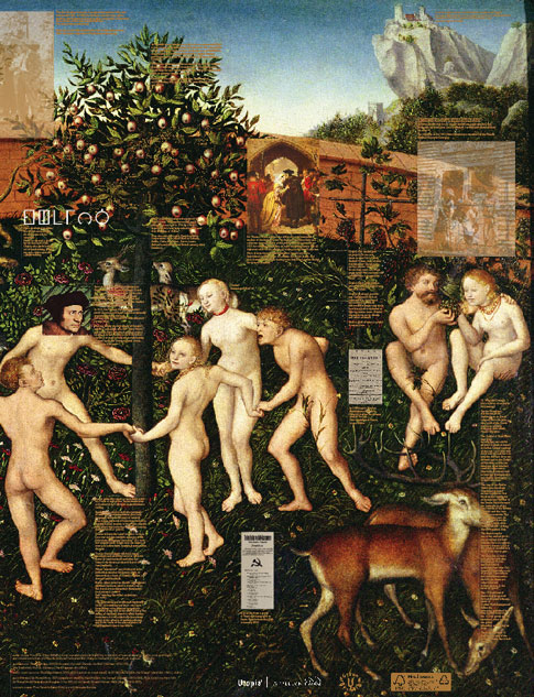
 What you see here is a poster. The first job ever printed on Appleton Coated's Utopia Two Extra Green Dull 80 pound cover, an FSC-approved sheet containing a minimum 30% post-consumer recovered fibre. Which means at least 30% recycled.
And the poster? Anything but dull, It hypes English's talk at the recent HOW Design Conference in Atlanta, regarding his Way of the Design Shaman: The Ecstatic Experience in the Creative Process. The art is 100% recycled, relying on a vision of The Golden Age, by German painter Cranach the Elder, circa 1530, portraying a party of a dozen, frolicking au natural in a Utopian setting, along a body of water not unlike the Rio Sabinal, in harmony with nature. Other art includes an iconic portrait of English, circa 2002, by German-American painter, Sir Marc Burckhardt.
The fine print on the B-side refers to Sir Thomas More - Englishman, statesman, philosopher, writer, martyr - who penned the novel Utopia in 1515. Other fine points note the first Utopian society founded in Georgia (host to this year's HOW conference), and the ecstatic notions of dance and drink, among other erudite and informative tidbits of knowledge. Ah, the glories of detail. And speaking of detail, should one align copies of the poster, front to back, the poster doubles in size, growing from 19" x 25" to 38" x 25".
What we find here is a way to grow ideas. Whether those of Appleton Coated finding means to create a paper that proves not only sustainable in every sense of the word, and is also a great sheet on which to print, but also a vehicle to shine a light on the past and the ideals of Sir Thomas More's Utopia, as well as promote the shameless thievery and hyperbole of designer Marc English, of Austin, Texas, who can be found at marcenglishdesign.com.
Ideas, ideals, Utopia, all in plain English.

Four color process, plus match metallic copper.
 7Bar Aviation
 AFS | Austin Film Society
 AFS | Austin Studios
 AFS | Quentin Tarantino Film Fest
 AFS | Slacker 2011
 AFS | Texas Film Hall of Fame 09
 AIGA | Design Ranch
 AMF | Love Austin Music
 Acran
Acran Alereon
 Alliance Abroad Group
 Arc Reps
 Austin Museum of Art Guild
 Cambridge Friends School
 GirlStart
 H2Hos
H2Hos Internet Police Alliance
 KIRK
KIRK Kinsei
 La Sonrisa Productions | Inside The Circle
 Lake Hills Church
 MARK Skateboards
 Marc English Design | Since 1993
 Mass. Association of Bank Council
 Mountain Crossings at Walasi-Yi
 Rancho Pancho
 Sharing Technologies
 Texas Film & Cattle Co.
 Texas Motion Picture Alliance
 Texas Writers Month
 Thokozani
 Trails to Growth
 Troublemaker Studios
 Tsogolo La Thanzi Centre
 UT/Austin | School of Architecture
 Unnatural Axe
 Wright Legal
 ABC-TV | Healthy Start / Healthy Babies
 ACADIA: Suicide, Sex & Success
 AFS | 20th Retrospective
 AFS | Essential Cinema
 AIGA Atlanta
 AIGA Austin | Love | Work
 AIGA Baltimore
 AIGA Birmingham
  AIGA Boston | Touch of Power
 AIGA Charlotte
  AIGA Honolulu
 AIGA Houston | Doug Sahm
 AIGA Iowa | Fertilizing Minds
 AIGA Las Vegas
 AIGA Miami
 AIGA Nashville
  AIGA Omaha | The Wolves of Texas
 AIGA Philadelphia
 AIGA Washington, D.C.
  Angels You Left
 Art Directors Club of Tulsa
 Auburn University
 BF/VF | Laurie Anderson
 BF/VF | MIra Nair
 Green Room Pictures
 HOW Design Conference 2007
 La Sonrisa Productions | Inside the Circle
 Manufacturing Dissent
 NWAADC Perspective
 NWAADC Step No. 3: O.B.E.
 Quinto Malo Films | One Minute to Nine
 Ransom Center | Avant Garde Film
 Ransom Center | Brit Noir
 Ransom Center | Voyages
 Texas Film Hall of Fame
 Texas Writers Month | 1997 | O. Henry
 Texas Writers Month | 1998 | Porter
 Texas Writers Month | 1999 | McMurtry
 Texas Writers Month | 2000 | McCarthy
 Texas Writers Month | 2001 | Kelton
 Texas Writers Month | 2002 | Carpenter
 Texas Writers Month | 2003 | Dobie
 Texas Writers Month | 2004 | Michener
 Criterion | Border Radio
 Criterion | Dazed and Confused
 Criterion | My Own Private Idaho
 Criterion | Naked
 Criterion | Slacker
 Criterion | Two-Lane Blacktop
 Criterion | Walker
 Honora Jacob
 Internet Police Alliance
 Kinsei
 Legacy Trails
 MARK Skateboards | website
 Site59
 AFS | 20th Retrospective
 AFS | Austin Studios brochure
 AFS | Texas Film Hall of Fame
 Austin Chronicle | English: 2nd Language
 Austin Film Society | PoV
 Austin Museum of Art Guild
 Chronicle Books | Cooking Up A Storm
 Chronicle Books | Where Flavor Was Born
 City of Austin | Create Austin Cultural Plan
 Four Hands
 Houghton Mifflin | About Language
 Indigenous Art of Coahuila
 Inspirational Hollywood
 Massachusetts College of Art | Compton
 Meta Design
 Rockport Publishers | Designing Identity
 Texas Fine Art Association | Pulp Fictions
 Texas Fine Arts Association
 Texas Writers Month
 The Art of Beowulf
 UT Department of Education
 UTSoA | Planning Forum
 Vtel
Vtel Xetel Corporation
  AFS | Essential Cinema
 AFS | Fundraising Invitation
 AFS | Make Watch Love Film
 Arts Alliance America | Inning By Inning
 Booker Music | Craig Hella Johnson
  Boston Brownies
 Criterion | Border Radio
 Criterion | Dazed and Confused
 Criterion | Naked
 Criterion | Slacker
 Criterion | Two-Lane Blacktop
 Criterion | Walker
 Dr. Dreams Juice Machine
 LOL
LOL La Peste
 MARK Skateboards | decks
 Merchants of Venus
 The Good Seeds
  The Stains
 Two Mule Records
 Whole Foods Market | 365 Pasta | bag
 Whole Foods Market | 365 Pasta | box
 Whole Foods Market | Belgian Chocolates
 Whole Foods Market | Pasta
 Whole Foods Market | Pasta family
 Whole Foods Market | Seasonal Specialties
 Whole Foods Market | Truffles